Below are a few book covers on copies of Calvino’s Invisible Cities, with a variety of interpretations in their use of color and degree of abstraction. It’s hard to pinpoint exactly what is most successful, and the reasons as to why.


Below are a few book covers on copies of Calvino’s Invisible Cities, with a variety of interpretations in their use of color and degree of abstraction. It’s hard to pinpoint exactly what is most successful, and the reasons as to why.
I think a movie poster of one kind because it has to capture the main theme without resorting to flat out saying what it’s about. So I always enjoy looking at movie posters, both before and after watching the movie.
Whenever I need some design inspiration, I like going through minimalist movie posters. Although they may not be best for those who have not watched the movie yet, they always capture something essential about the movie in a very clever way.


attached is the link to my high school’s website I mentioned where the million dollar sports field and brand deal is heavily focused. https://bvhs.org


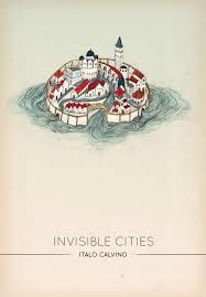

There are many different interpretations to the cover of invisible cities.
At the Helen Frankenthaler exhibition on Tuesday, you may have noticed that some of her works had ‘mixografia’ listed as one of the media. Sirocco (1989) is one such work that we saw at the “Frankenthaler on Paper” exhibition.

It’s a strange word, and even stranger and fascinating medium. Mixografia is actually the name of a printmaking studio founded in 1984 by Luis and Lea Ramba, as well as the name of the process the family has used in making three-dimensional prints. They use water and fibers as raw material to produce their own paper with fine details in texture. To add the necessary colors to pieces, they also make copper printing plates that get inked with the appropriate colors, which are then pressed into the paper.

The results of this process are incredible, allowing artists to make unique, complex works. The piece shown in the workshop photo above is Ed Ruscha’s Rusty Signs – For Sale (2014).

Check out some other incredible works below! As our class is not privy to making three-dimensional prints for Project 1.3, how can we recreate the appearance of textures in Illustrator or Photoshop? What brushes, symbols, or effects could help bring our invisible cities to life? (And yes, the work below called Have a Nice Day, Thank You! Plastic Bag (2016) by Analia Saban really is made out of paper).


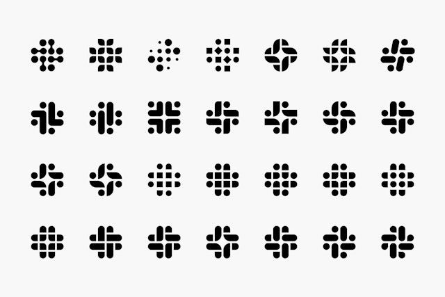
Slack’s new logo is supposed to resemble a hashtag, or octothorpe. but it represents a lot more than that. Here is what Pentagram, the agency that designed the logo, said about it.
“Derived from the original logo and built on a grid, the new octothorpe is comprised of two basic geometric shapes—a speech bubble and lozenge—that can be extracted and used as graphic elements. The speech bubble evokes communication and connectivity, and will form the basis of a system of customized icons, illustrations and motifs with rounded corners that echo the shapes of the logo.” (https://www.pentagram.com/work/slack/story)

Interestingly, here are some of the iterations they went through before arriving at the final design.
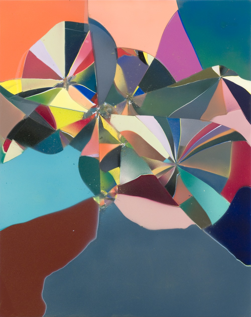
Tauba Auerbach is an artist who works with abstraction and typography. Her works involves type design, something precise, technical and governed by a lot of rules. Her work also includes abstract works, where there aren’t any decisive rules. She combines the two in interesting ways. This is her website: taubaauerbach.com

She creates grid patterns and then creates typefaces based on those grids. She also makes purely abstract works with non traditional methods like this acrylic and glass on wood panel.
Kandinsky was one of the creators of the first modern abstract paintings. He has been called the “Father of Abstract Art“. Kandinsky was an influential Russian painter and art theorist. He believed he could convey emotions through the colors he was inspired by.


