Aspects of art and design have become increasingly important in the data science community. A 2018 article from Forbes, for example, explains the “art of data science” :
It’s generally easy to tell when data is represented successfully and whether the conclusions to be drawn from it are appropriately highlighted in the graphs and charts.
Some interesting examples taken from the subreddit r/dataisbeautiful :
Especially now, I’m sure we’re all looking at graphs of coronavirus trends and heat maps of heavily-impacted regions. And as crucial as the numbers/statistics themselves are, it’s also important to remember and appreciate the design that goes into generating forms that the public can digest.
I included an Agnes Martin piece as part of my desktop portrait. Her paintings as seen on a computer screen do not do them justice. The scale and subtlety in her pieces cannot be conveyed unless you see them in person, so while I include some pictures here, it won’t be the same.
Martin said she was not trying to paint anything of or from the world, but instead was trying to paint inspiration and emotion itself.
The famous art dealer Arne Glimcher says this about Agnes Martin:
“Agnes was totally interested in the internal response not the external. She did a cycle of six paintings that MoMA owns, they’re called “With My Back To The World.” The title was the expression of the fact that her work does not refer to anything outside the mind – that it’s all internalised.”
There are a couple quotes from her that I really like.
From music people accept pure emotion but from art they demand explanation.
Even though the next couple of sentences are explanation of her art, I think they may add some useful background to her process. She abandoned the New York art world in 1967 and moved to New Mexico. She lived in adobe homes that she built herself. She was gay. She was diagnosed with schizophrenia. She was friends with artists like Ad Reinhardt and Bruce Nauman. She lived alone most of her life alone, and when she died in 2004, she hadn’t read a newspaper in over 50 years.
If you wake up in the morning and feel very happy, about nothing, no cause, that’s what I paint about, the subtle emotions that we feel without cause in this world.
As Martin’s paintings became popular with collectors, she became wealthy but never moved out of her homes in New Mexico. Instead, she donated millions of dollars to charity, especially organizations who helped marginalized groups and victims of domestic violence.
As I started to work on the food processing project, I thought about how geometric, formulated, and “processed” that the food we are designing is, and how it compares with actual food. I found these art pieces made in 2012 which are a kind of combination of genuine and geometric food. I think these compositions are really unique, and they play with your eyes and confuse your mind.
Animations by Toby Morris and Siouxsie Wiles show importance of social distancing during the COVID-19 outbreak. After being published in New Zealand, these illustrations have now gone viral all around the world.
Many companies are creating new versions of their logos to bring attention to social distancing during the COVID-19 pandemic.
AudiMcDonald’s BrasilVolkswagen Daum, a Korean portal site. Original version (left) and updated version (right)
Other than the official versions, a graphic designer Jure Tovrligan tweaked the logos of some famous brands, reflecting how this pandemic is affecting our lives.
Pawel Kuczynski is a Polish, award-wining, anti-war political artist, who delivers his message through satirical drawings and paintings. It was amazing to just look carefully and see how much meaning all his artwork has with no single word used. I thought some of the images could apply to our current situation right now during COVID-19. Here are some of his artwork.
While getting to know Processing as a tool to create artwork, there’s a sense for me that although I am able to depict the food I want to, I feel I cannot do it as aesthetically as I would like. I think I’ve been so used to the ease of Illustrator or Photoshop where you can plop shapes and lines anywhere and transform them.
I’m not sure if those of you who have a lot of experience in coding feel the same or even if those of you who are new to it feel the same, but this has made me feel stuck. So I did some digging for inspiration, and I hope these help out anyone who is feeling the same as me.
The artist here, Owen Davey, has a unique style and the illustration does come across as food to us, even if the food may not be immediately clear. We can still identify the two drinks, and then macarons and some fruit (lychees). He doesn’t use a lot of outlines for his shapes and the colors are bright. Processing would allow you to make a lot of the ellipses, rectangles with round corners, get rid of the stroke/outlines, etc.
Johanna Kindvall here does use outlines and more muted colors. This video show us how the image/dish is layered— there are triangular shapes, semi-circles, ellipses for cucumbers, lines for the herbs, etc. She also doesn’t really have any shading/shadows.
Sandy van Loon has a mix of outlines with no color filled in (the transparent jar) and shapes without outlines (fruits). The colors overall have a warmer hue to them.
This last artwork, by Becky Cas, has a much cuter mood compared to the other illustrations. The colors are pastel and more of a cooler hue. There are ellipses and rectangles used, as well as variations in the shapes’ opacity. If any of these artists interested you, definitely explore their Instagram!
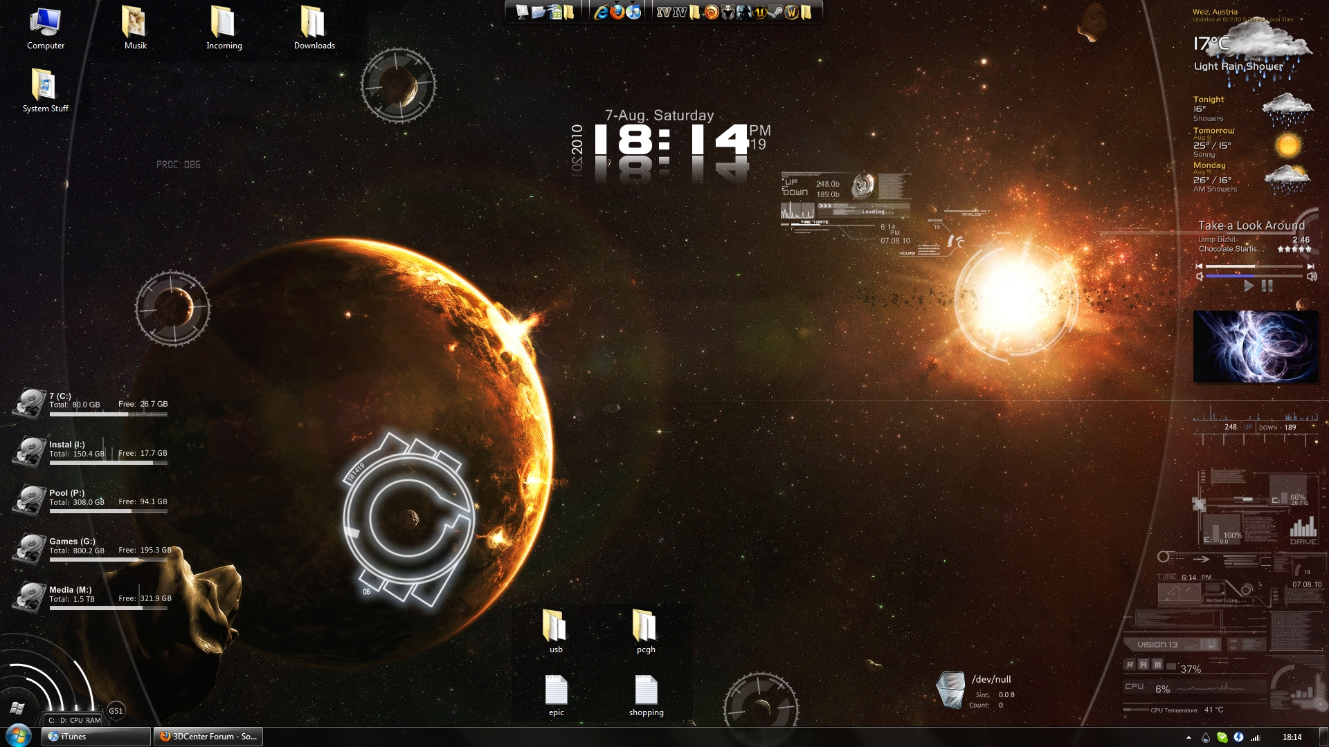
So there’s this pretty cool software for windows that I’ve known about for a while called Rainmeter. In short, it’s basically a desktop customization tool that has some cool features. Below are some examples of works people have done for their desktop using this software.
Transhumanism is an intellectual movement that aims to augment the human body through use of sciences and technique. Photographer Matthieu Gafsou explored the intimate relationship between human and technology in his exhibition “H+”. See all his exhibition at here: http://www.gafsou.ch/hplus
Marie-Claude Baillif has suffered from myopathy since adolescence. Without her respirator, she would have died thirty years ago. Her website features eloquent articles about her special relationship to technology: “My survival depends on microprocessors and electronic cards”; “Electricity is a matter of life or death for me”; “I love my phlegm aspirator”; “A little battery is magical; it transforms my life.” Technological devices keep her alive.Inheriting the incubator means growing up in an immensely fragile environment that offers no guarantee outside those provided by the unsettling actions of knowledge, treatments, tubes, food, temperatures, and monitors. Instead of technically supporting desires for power turned towards the future, the incubator prompts the telling of another story, actively concentrating on a fragile present, a story woven from countless vital and uncertain relationships. Inheriting the incubator means insisting on remembering that technology and biology are committed to continuously building eminently precarious relationships. Gabriel Dorthe in “Héritier de la couveuse,” A contrario, no. 22, bsnPRESS, 2016.
Will we have a virtual graduation ceremony this year?