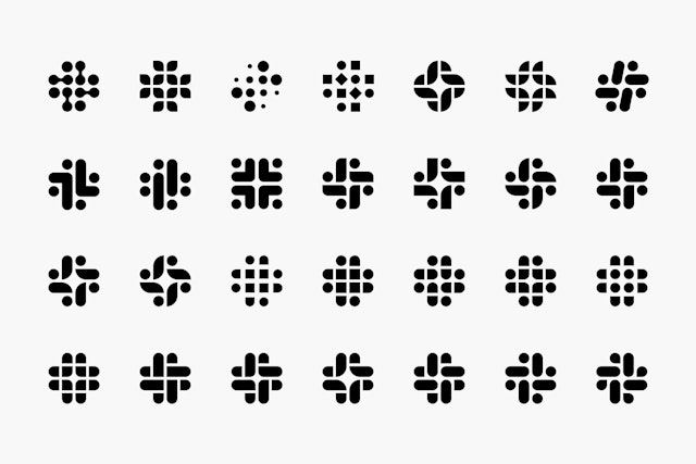
Slack’s new logo is supposed to resemble a hashtag, or octothorpe. but it represents a lot more than that. Here is what Pentagram, the agency that designed the logo, said about it.
“Derived from the original logo and built on a grid, the new octothorpe is comprised of two basic geometric shapes—a speech bubble and lozenge—that can be extracted and used as graphic elements. The speech bubble evokes communication and connectivity, and will form the basis of a system of customized icons, illustrations and motifs with rounded corners that echo the shapes of the logo.” (https://www.pentagram.com/work/slack/story)

Interestingly, here are some of the iterations they went through before arriving at the final design.